What is Color | Color Theory
Color Theory
What is Color :
- Color is the general name of all the sensation arising from the activity of retina of the eye & attached nervous mechanism.
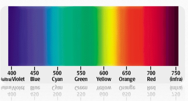
- We see are the colors of the visual spectrum of red, orange, yellow, green, blue & violet.
- Objects absorb certain wavelength & reflect others back to viewer. We perceive this wavelength as color.
- Human vision relies on light sensitive cells in the retina of the eye. There are two basic kinds of sensors. These are rods and cones.
- Rods are cells which can work at very low intensity, but cannot resolve sharp images or color. Cones are cells that can resolve sharp images and color, but require much higher light levels to work. The combined information from these sensors is sent to the brain and enables us to see.
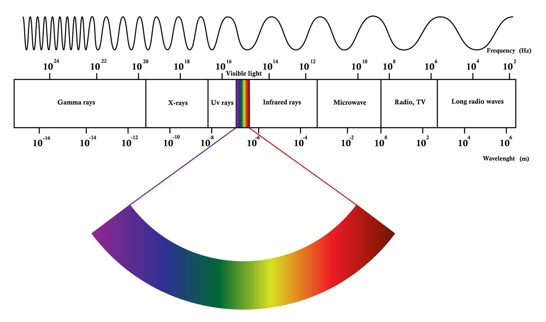
- Human eye can only see a short range of wavelength from 400nm to 750nm.
Spectrum of visible light
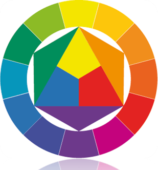
- The color wheelor color circle is the basic tool for combining colors.
- The first circular color diagram was designed by Sir Isaac Newton in 1666.
- The color wheel is designed so that virtually any colors you pick from it will look good together.
- Over the years, many variations of the basic design have been made.
- The most common version is a wheel of 12 colors based on the RYB (or artistic) color model.
Primary color
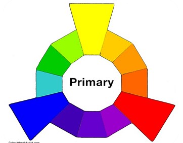
- In the RYB (or subtractive) color model, the primary colors are Red, Yellow and Blue.
- In traditional color theory (used in paint and pigments), primary colors are the 3 pigment colors that cannot be mixed or formed by any combination of other colors. All other colors are derived from these 3 hues.
Secondary color
- The three secondary colors ( Green, Orange and Purple ) are created by mixing two primary colors.
Tertiary color
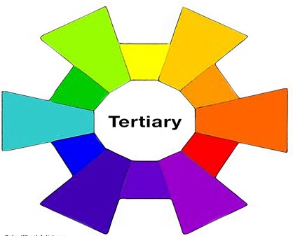
- Another six tertiary colors are created by mixing primary and secondary colors.
- Like Yellow-orange, red-orange, red-purple, blue-purple, blue-green & yellow-green.
- These are the colors formed by mixing a primary and a secondary color.
- That’s why the hue is a two word name, such as blue-green, red-violet, and yellow-orange.
Warm & Cool color
- The color circle can be divided into warm and cool colors.
- Warm colors are vivid and energetic and tend to advance in space.
- Red yellow, oranges are warm color. They create feelings of warmth, activities & excitement.
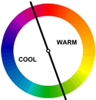
- Cool colors give an impression of calm, and create a soothing impression.
- Blue purple & green are cool color. Create feelings of coolness, calmness & relaxation.
Natural color
White, black, brown, tan cream and gray are considered to be neutral. They are not found in color wheel.
Color Harmony
Color harmony can be defined as a pleasing arrangement of something pleasing to eye.it creates the sense of balance & order to the viewers. If it is not harmonious it becomes boring.
Complementary color schemes
- Colors that are opposite each other on the color wheel are considered to be complementary colors (example: red and green).
- The high contrast of complementary colors creates a vibrant look especially when used at full saturation.
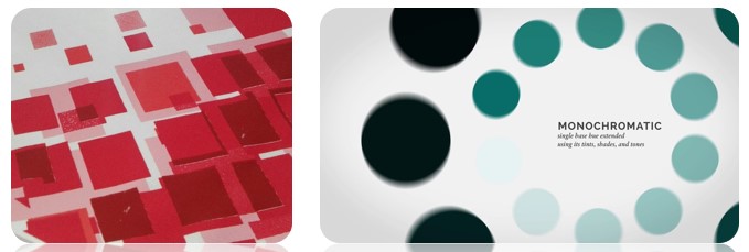
Monochromatic
- Mono means one & chrome means hue or color. Monochromatic means using one hue by adding white, black or grey to create tint, tone & shade.
Analogous color scheme
- Analogous color schemes use colors that are next to each other on the color wheel.
- They usually match well and create serene and comfortable designs.
- Analogous color schemes are often found in nature and are harmonious and pleasing to the eye.
- Make sure you have enough contrast when choosing an analogous color scheme.
Triadic color scheme
- Triadic colors are evenly spaced around the color wheel and tend to be very bright and dynamic
- A triadic color scheme uses colors that are evenly spaced around the color wheel.
Split-complementary color scheme
- The split-complementary color scheme is a variation of the complementary color scheme.
- In addition to the base color, it uses the two colors adjacent to its complement.
- This color scheme has the same strong visual contrast as the complementary color scheme, but has less tension.
- The split-complimentary color scheme is often a good choice for beginners, because it is difficult to mess up
Tints, Shades, and Tones
- These terms are often used incorrectly, although they describe fairly simple color concepts.
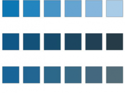
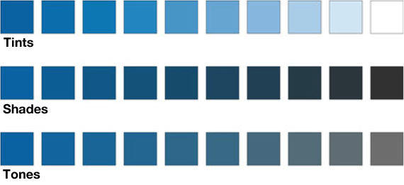
- Tints, tones, and shades are variations of the hues found on the basic color wheel when white, black or both are mixed in.
Tint
If a color is made lighter by adding white, the result is called a tint.
Shade
If black is added, the darker version is called a shade.
Tone
If gray is added, the result is a different tone.
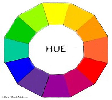
- The name of color. More specifically, a hue is any color on the color wheel.
- A HUE refers to the dominant Color Family of the specific color we’re looking at.
- White, Black and Grey are never referred to as a Hue.
Saturation or Chroma
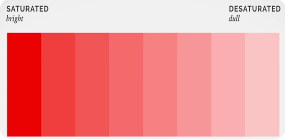
- Saturation defines the brilliance and intensity of a color.
- It means the brightness or dullness of hue.
- It shows When a pigment hue is “toned,” both white and black (grey) are added to the color to reduce the color’s saturation.
Lightness Value
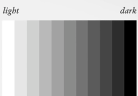
- Lightness Value is the dimension of lightness/darkness.
- In terms of a spectral definition of color, value describes the overall intensity or strength of the light.
- If hue can be thought of as a dimension going around a wheel, then value is a linear axis running through the middle of the wheel.
Color Mixing Theory
Virtually all our visible colors can be produced by utilizing some combination of 3 primary colors. They are mixed in specific pairs to create secondary colors. There are 2 theory of color mixing. They are
- Additive theory
- Subtractive theory
Additive theory
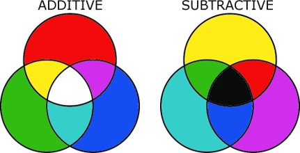
- It is also called RGB theory. In this process color is created by adding light (red, green& blue) to dark background.
- TV screens and projectors use red, green and blue (RGB) as their primary colors, and then mix them together to create other colors.
- From this theory we found
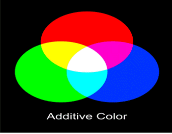
Red + Green =Yellow
Green +Blue =Cyan
Blue + Red =Magenta
Red +Blue + Green=White
- Additive color processes, such as television, work by having the capability to generate an image composed of red, green, and blue light.
- The 3 primaries in light are red, blue,andgreen, because they correspond to the red, blue, and green cones in the eye.
- Example shows how the light from red, green and blue flashlights would appear if shone on a dark wall
- It is also called CYMK theory.
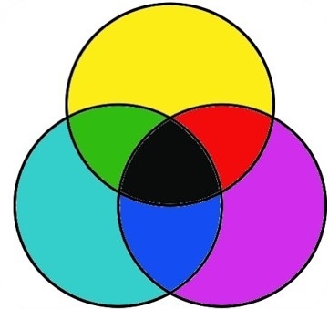
- Subtractive color, like additive, has three primary colors – Cyan, Magenta, and Yellow (CMY).
- In subtractive color white is the absence of color, while black is the combination of color, but it’s an imperfect system.
- We call this “Key”, hence CMYK, but essentially it’s black
- Subtractive color synthesis is the creation of color by mixing colors of pigment, such as paint or ink in your computer printer. This type of color is what is used in the art and design world.
- Subtractive color processes work by blocking out parts of the spectrum. The idea of subtractive color is to reduce the amount of undesired color reaching the eye.
- If, for example, you had a yellow image, you would want to have a dye that would let red and green reach the eye, and block out blue.
- The additive secondary become the printers subtractive primaries, because each of the additive secondary will reflect two of the additive primaries, and absorb one of the additive primaries
(6926)
